More Than Points on a Map: How Infographics Boost Your PR Game
Maps can do more than display places. When designed with intention, they tell compelling stories, add credibility to your data, and make your content easier to share. Here’s why map infographics are a smart move for digital PR.
MARKETING MATERIALSOVERVIEWGRAPHIC DESIGN SERVICES
Raymon Bosquillos
7/17/20251 min read
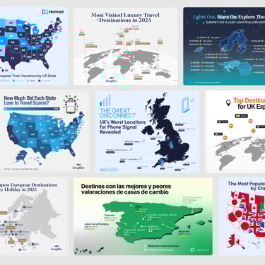
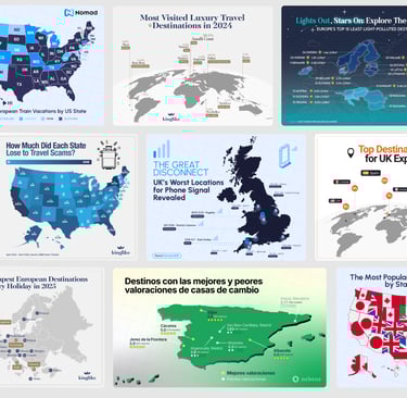
Maps don’t just show locations. They tell stories.
In digital PR, a well-designed map infographic can turn a simple data set into something meaningful, visual, and worth sharing. Whether you’re highlighting regional trends, comparing national statistics, or presenting global insights, maps add instant context that raw data simply can’t offer.
The impact goes beyond design. When paired with the right story, maps help your audience grasp information faster. They create clarity, spark curiosity, and increase the likelihood that your content gets picked up by publishers, bloggers, and media outlets.
Need to give life to a research-heavy blog post? Trying to turn a press release into something with more visual pull? A map infographic can bridge that gap. Not only does it make the information easier to understand, it also makes it more clickable and shareable.
The best part? These maps don’t have to be noisy or overly complex. When done right, they’re clean, on-brand, and made to stand out—designed to support your message, not distract from it.
If you’re working on digital PR campaigns, consider using map infographics to anchor your story visually. Because when your data is easier to read and more appealing to the eye, it travels farther.